
Icy Veins is getting a new look.
Preview it now on Diablo 4!
Diablo 2 Recommended Starter Builds
Farming Guides
Other Guides
Builds, Guides, and News for Diablo 2 Resurrected
 Blizzard Games Return to China: New Agreement Signed With NetEase
Some great news for Chinese players, as Blizzard have signed a new agreement with NetEase, and players will be returning to their games as early as summer 2024!
Blizzard
Blizzard
5 comments
Apr 10, 2024 at 01:11
Blizzard Games Return to China: New Agreement Signed With NetEase
Some great news for Chinese players, as Blizzard have signed a new agreement with NetEase, and players will be returning to their games as early as summer 2024!
Blizzard
Blizzard
5 comments
Apr 10, 2024 at 01:11
 Blizzard Reportedly Reuniting with NetEase to Bring Back WoW in China
Blizzard games like World of Warcraft, Hearthstone, and Overwatch 2 might soon make a comeback in China, thanks to Blizzard reportedly teaming up again with NetEase.
Blizzard
Blizzard
5 comments
Mar 15, 2024 at 13:01
Blizzard Reportedly Reuniting with NetEase to Bring Back WoW in China
Blizzard games like World of Warcraft, Hearthstone, and Overwatch 2 might soon make a comeback in China, thanks to Blizzard reportedly teaming up again with NetEase.
Blizzard
Blizzard
5 comments
Mar 15, 2024 at 13:01
 Ex-Activision Blizzard CEO Bobby Kotick Shows Interest in Buying TikTok
According to WSJ, Bobby Kotick, former CEO of Activision Blizzard, has floated the idea of buying TikTok to potential partners.
Blizzard
Blizzard
15 comments
Mar 13, 2024 at 19:17
Ex-Activision Blizzard CEO Bobby Kotick Shows Interest in Buying TikTok
According to WSJ, Bobby Kotick, former CEO of Activision Blizzard, has floated the idea of buying TikTok to potential partners.
Blizzard
Blizzard
15 comments
Mar 13, 2024 at 19:17
 Diablo 2: Resurrected Ladder Season 6 Details and Launch Times
Blizzard have detailed everything about the sixth ladder season of D2:R, with the new addition coming on the 22nd! We have regional launch times, the different modes, and an explanation on what happens to shared stash items for seasonal character after it ends, so let's take a look.
Diablo II: Resurrected
D2R
Feb 15, 2024 at 18:29
Diablo 2: Resurrected Ladder Season 6 Details and Launch Times
Blizzard have detailed everything about the sixth ladder season of D2:R, with the new addition coming on the 22nd! We have regional launch times, the different modes, and an explanation on what happens to shared stash items for seasonal character after it ends, so let's take a look.
Diablo II: Resurrected
D2R
Feb 15, 2024 at 18:29
 Timeline of Blizzard Presidents
With Johanna Faires recently taking on the role of the new President at Blizzard, let's delve into the history of Blizzard Presidents from 1991 up to the present.
Blizzard
Blizzard
3 comments
Feb 02, 2024 at 15:34
Timeline of Blizzard Presidents
With Johanna Faires recently taking on the role of the new President at Blizzard, let's delve into the history of Blizzard Presidents from 1991 up to the present.
Blizzard
Blizzard
3 comments
Feb 02, 2024 at 15:34
 Johanna Faires Appointed Blizzard Entertainment President
Blizzard Entertainment has named Johanna Faires as its new president, taking over from Mike Ybarra, who left the company last week.
Blizzard
Blizzard
16 comments
Jan 29, 2024 at 18:25
Johanna Faires Appointed Blizzard Entertainment President
Blizzard Entertainment has named Johanna Faires as its new president, taking over from Mike Ybarra, who left the company last week.
Blizzard
Blizzard
16 comments
Jan 29, 2024 at 18:25
 Will Microsoft Outsource Customer Support to External Companies?
In the wake of Microsoft's decision to lay off nearly 1,900 employees from its Activision Blizzard and Xbox divisions, there's growing speculation about a strategic shift in customer support for ABK games. Jez Corden, the Managing Editor at Windows Central, has shed light on this development through a series of tweets.
Blizzard
Blizzard
11 comments
Jan 26, 2024 at 20:53
Will Microsoft Outsource Customer Support to External Companies?
In the wake of Microsoft's decision to lay off nearly 1,900 employees from its Activision Blizzard and Xbox divisions, there's growing speculation about a strategic shift in customer support for ABK games. Jez Corden, the Managing Editor at Windows Central, has shed light on this development through a series of tweets.
Blizzard
Blizzard
11 comments
Jan 26, 2024 at 20:53
 Blizzard Survival Game, Codenamed Odyssey, Was Cancelled Due to Engine Problems
We have some more news on today's unfortunate events at Blizzard, as Bloomberg's Jason Schreier explains the big reason the in-development survival game was cancelled. He spoke to people familiar with the project, and dives into what exactly happened below.
Blizzard
Blizzard
4 comments
Jan 25, 2024 at 22:33
Blizzard Survival Game, Codenamed Odyssey, Was Cancelled Due to Engine Problems
We have some more news on today's unfortunate events at Blizzard, as Bloomberg's Jason Schreier explains the big reason the in-development survival game was cancelled. He spoke to people familiar with the project, and dives into what exactly happened below.
Blizzard
Blizzard
4 comments
Jan 25, 2024 at 22:33
 Microsoft Lays Off 1,900 Activision Blizzard and Xbox Employees
Microsoft is laying off 1,900 employees at Activision Blizzard and Xbox. Blizzard President Mike Ybarra has decided to leave the company along with Blizzard's Chief Design Officer Allen Adham.
Blizzard
Blizzard
12 comments
Jan 25, 2024 at 17:33
Microsoft Lays Off 1,900 Activision Blizzard and Xbox Employees
Microsoft is laying off 1,900 employees at Activision Blizzard and Xbox. Blizzard President Mike Ybarra has decided to leave the company along with Blizzard's Chief Design Officer Allen Adham.
Blizzard
Blizzard
12 comments
Jan 25, 2024 at 17:33
 Blizzard Celebrates the End of 2023 and Looks Ahead to 2024
Blizzard President Mike Ybarra recently shared a 2023 recap, highlighting a year of significant learning, growth, and joy at Blizzard. He also shared his outlook for 2024.
Blizzard
Blizzard
Dec 20, 2023 at 19:26
Blizzard Celebrates the End of 2023 and Looks Ahead to 2024
Blizzard President Mike Ybarra recently shared a 2023 recap, highlighting a year of significant learning, growth, and joy at Blizzard. He also shared his outlook for 2024.
Blizzard
Blizzard
Dec 20, 2023 at 19:26
 Microsoft Announced Xbox Leadership Changes Amid Bobby Kotick's Departure
Activision Blizzard CEO Bobby Kotick is stepping down on December 29 and Microsoft is largely keeping the team of Activision Blizzard in place, with some executive-level exceptions, according to the Verge. Check them out!
Blizzard
Blizzard
4 comments
Dec 20, 2023 at 18:07
Microsoft Announced Xbox Leadership Changes Amid Bobby Kotick's Departure
Activision Blizzard CEO Bobby Kotick is stepping down on December 29 and Microsoft is largely keeping the team of Activision Blizzard in place, with some executive-level exceptions, according to the Verge. Check them out!
Blizzard
Blizzard
4 comments
Dec 20, 2023 at 18:07
 22 Nights of Terror Holiday Event Returns to Diablo II: Resurrected
From December 12 through January 3, the 22 Nights of Terror holiday event will be available in Diablo II: Resurrected.
Diablo II: Resurrected
D2R
Dec 08, 2023 at 18:18
22 Nights of Terror Holiday Event Returns to Diablo II: Resurrected
From December 12 through January 3, the 22 Nights of Terror holiday event will be available in Diablo II: Resurrected.
Diablo II: Resurrected
D2R
Dec 08, 2023 at 18:18
 Microsoft Gaming CEO Phil Spencer Enthusiastic About Reviving Blizzard Franchises
Microsoft Gaming CEO Phil Spencer expressed a lot of excitement for the possibilities of reviving Blizzard franchises, according to an interview with Windows Central.
Blizzard
Blizzard
2 comments
Dec 07, 2023 at 19:48
Microsoft Gaming CEO Phil Spencer Enthusiastic About Reviving Blizzard Franchises
Microsoft Gaming CEO Phil Spencer expressed a lot of excitement for the possibilities of reviving Blizzard franchises, according to an interview with Windows Central.
Blizzard
Blizzard
2 comments
Dec 07, 2023 at 19:48
 Icy Veins Launches Genshin Impact Guides Section
We at Icy Veins are thrilled to announce the launch of our new section dedicated to in-depth guides and resources for Genshin Impact.
Icy Veins
Icy Veins
5 comments
Nov 29, 2023 at 19:37
Icy Veins Launches Genshin Impact Guides Section
We at Icy Veins are thrilled to announce the launch of our new section dedicated to in-depth guides and resources for Genshin Impact.
Icy Veins
Icy Veins
5 comments
Nov 29, 2023 at 19:37
 Battle.net Black Friday Sale: Up to 67% Off
Blizzard just posted their Black Friday sale! They are offering up to 67% off on Battle.net games, so let's take a look at the offers, valid through November 27th!
Battle.net
Battle.net
3 comments
Nov 16, 2023 at 05:47
Battle.net Black Friday Sale: Up to 67% Off
Blizzard just posted their Black Friday sale! They are offering up to 67% off on Battle.net games, so let's take a look at the offers, valid through November 27th!
Battle.net
Battle.net
3 comments
Nov 16, 2023 at 05:47
 Mike Ybbara on Blizzard's Approach to Meeting Player Demands
PC Gamer had the chance to talk to Blizzard President Mike Ybarra who said Blizzard's job is to satisfy impatient players who want "new stuff every day, every hour".
Blizzard
Blizzard
6 comments
Nov 11, 2023 at 11:04
Mike Ybbara on Blizzard's Approach to Meeting Player Demands
PC Gamer had the chance to talk to Blizzard President Mike Ybarra who said Blizzard's job is to satisfy impatient players who want "new stuff every day, every hour".
Blizzard
Blizzard
6 comments
Nov 11, 2023 at 11:04
 BlizzCon 2023 Stream and Announcements Summary
We're liveblogging all the important announcements and highlights from the opening ceremony. Check back often for updates!
Blizzard
Blizzard
2 comments
Nov 03, 2023 at 17:12
BlizzCon 2023 Stream and Announcements Summary
We're liveblogging all the important announcements and highlights from the opening ceremony. Check back often for updates!
Blizzard
Blizzard
2 comments
Nov 03, 2023 at 17:12
 BlizzCon 2023 Bingo Collection
We're 2 hours away from this year's opening ceremony at BlizzCon and the community is already guessing what will be announced today, so we're taking a look at some bingo cards for the event!
BlizzCon
BlizzCon
6 comments
Nov 03, 2023 at 15:20
BlizzCon 2023 Bingo Collection
We're 2 hours away from this year's opening ceremony at BlizzCon and the community is already guessing what will be announced today, so we're taking a look at some bingo cards for the event!
BlizzCon
BlizzCon
6 comments
Nov 03, 2023 at 15:20
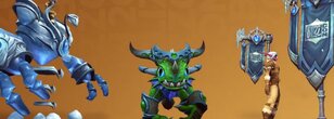
 WoW Battle Pet and Hearthstone Card Back Promotion From Warcraft Rumble
Players getting the free to play Warcraft Rumble on their mobile devices were greeted with a nice bonus! The game released a day early and those trying it out today found a Hearthstone card back and the WoW Gnomelia Battle Pet reward just for starting the game!
Blizzard
Blizzard
6 comments
Nov 02, 2023 at 21:49
WoW Battle Pet and Hearthstone Card Back Promotion From Warcraft Rumble
Players getting the free to play Warcraft Rumble on their mobile devices were greeted with a nice bonus! The game released a day early and those trying it out today found a Hearthstone card back and the WoW Gnomelia Battle Pet reward just for starting the game!
Blizzard
Blizzard
6 comments
Nov 02, 2023 at 21:49
 Warcraft Rumble Released a Day Early and Is Rolling Out Now!
It seems the Rumble just couldn't wait any longer! The Warcraft mobile game was scheduled to release tomorrow, but Blizzard pushed the button early and it has begun rolling out already! Plenty of players are reporting seeing it in their stores, but it's a rollout so it may take a while longer to get to you if it hasn't yet.
Blizzard
Blizzard
2 comments
Nov 02, 2023 at 19:08
Warcraft Rumble Released a Day Early and Is Rolling Out Now!
It seems the Rumble just couldn't wait any longer! The Warcraft mobile game was scheduled to release tomorrow, but Blizzard pushed the button early and it has begun rolling out already! Plenty of players are reporting seeing it in their stores, but it's a rollout so it may take a while longer to get to you if it hasn't yet.
Blizzard
Blizzard
2 comments
Nov 02, 2023 at 19:08
 BlizzCon 2023 Broadcast Schedule
Blizzard has released the broadcast schedule for BlizzCon 2023!
BlizzCon
BlizzCon
15 comments
Oct 27, 2023 at 17:46
BlizzCon 2023 Broadcast Schedule
Blizzard has released the broadcast schedule for BlizzCon 2023!
BlizzCon
BlizzCon
15 comments
Oct 27, 2023 at 17:46
 Microsoft Leaders Visit Blizzard Post $69B Acquisition, Hint at Brighter, Autonomous Future
Following their recent $69 billion acquisition of Activision-Blizzard-King, Microsoft is actively working to integrate and foster trust with their new teams. Key figures from Microsoft's leadership, including Phil Spencer, Matt Booty, and Sarah Bond, recently made their inaugural visit to Blizzard's headquarters in Irvine, California.
Blizzard
Blizzard
3 comments
Oct 25, 2023 at 14:35
Microsoft Leaders Visit Blizzard Post $69B Acquisition, Hint at Brighter, Autonomous Future
Following their recent $69 billion acquisition of Activision-Blizzard-King, Microsoft is actively working to integrate and foster trust with their new teams. Key figures from Microsoft's leadership, including Phil Spencer, Matt Booty, and Sarah Bond, recently made their inaugural visit to Blizzard's headquarters in Irvine, California.
Blizzard
Blizzard
3 comments
Oct 25, 2023 at 14:35
 Microsoft-Activision Blizzard Merger Memes
We're looking at memes that emerged soon after the Microsoft-Activision Blizzard merge was complete.
Blizzard
Blizzard
Oct 16, 2023 at 15:39
Bobby Kotick to Leave Activision Blizzard in January 2024
As the Microsoft-Activision deal closes, Bobby Kotick will only stay on as CEO through the end of the year and leave on January 1, 2024.
Blizzard
Blizzard
13 comments
Oct 13, 2023 at 13:49
Microsoft-Activision Blizzard Merger Memes
We're looking at memes that emerged soon after the Microsoft-Activision Blizzard merge was complete.
Blizzard
Blizzard
Oct 16, 2023 at 15:39
Bobby Kotick to Leave Activision Blizzard in January 2024
As the Microsoft-Activision deal closes, Bobby Kotick will only stay on as CEO through the end of the year and leave on January 1, 2024.
Blizzard
Blizzard
13 comments
Oct 13, 2023 at 13:49
 Activision Blizzard King Joins Xbox - Official Trailer
Xbox has released a new video welcoming the legendary teams of Activision Blizzard King to Xbox.
Blizzard
Blizzard
4 comments
Oct 13, 2023 at 13:09
Activision Blizzard King Joins Xbox - Official Trailer
Xbox has released a new video welcoming the legendary teams of Activision Blizzard King to Xbox.
Blizzard
Blizzard
4 comments
Oct 13, 2023 at 13:09
 UK's CMA Approves Microsoft/Activision Blizzard Merger
Nothing stands in the way of the Microsoft/Activision Blizzard merger now that the CMA (regulatory authority in the UK) approved the transaction with Microsoft.
Blizzard
Blizzard
5 comments
Oct 13, 2023 at 08:12
UK's CMA Approves Microsoft/Activision Blizzard Merger
Nothing stands in the way of the Microsoft/Activision Blizzard merger now that the CMA (regulatory authority in the UK) approved the transaction with Microsoft.
Blizzard
Blizzard
5 comments
Oct 13, 2023 at 08:12
 The BlizzCon Collection Detailed
The BlizzCon collection has been revealed, with a whole bunch of goodies for Blizzard games. As the stream is completely free this year, this replaces the Virtual Ticket and the rewards usually associated with it. Let's take a look at the two packs on offer!
BlizzCon
BlizzCon
7 comments
Oct 09, 2023 at 21:33
The BlizzCon Collection Detailed
The BlizzCon collection has been revealed, with a whole bunch of goodies for Blizzard games. As the stream is completely free this year, this replaces the Virtual Ticket and the rewards usually associated with it. Let's take a look at the two packs on offer!
BlizzCon
BlizzCon
7 comments
Oct 09, 2023 at 21:33
 UK's CMA Gives Preliminary Nod to Microsoft/Activision Blizzard Merger
The UK's Competition and Markets Authority (CMA) has preliminarily approved of the Microsoft / Activision Blizzard merger, but Activision's Cloud gaming rights will be sold to Ubisoft.
Blizzard
Blizzard
2 comments
Oct 01, 2023 at 09:21
UK's CMA Gives Preliminary Nod to Microsoft/Activision Blizzard Merger
The UK's Competition and Markets Authority (CMA) has preliminarily approved of the Microsoft / Activision Blizzard merger, but Activision's Cloud gaming rights will be sold to Ubisoft.
Blizzard
Blizzard
2 comments
Oct 01, 2023 at 09:21
 BlizzCon 2023 Floor Map Unveiled
Blizzard has unveiled the BlizzCon 2023 floor map. The event's taking place between November 3-4 in Anaheim, California.
BlizzCon
BlizzCon
Oct 01, 2023 at 08:03
BlizzCon 2023 Floor Map Unveiled
Blizzard has unveiled the BlizzCon 2023 floor map. The event's taking place between November 3-4 in Anaheim, California.
BlizzCon
BlizzCon
Oct 01, 2023 at 08:03
 Diablo 2: Resurrected Ladder Season 5 Is Live Now!
A new season of D2:R has started! You can see the official post below and you can also check out all our guides for it here or head to one of the guides below.
Diablo II: Resurrected
D2R
Sep 28, 2023 at 21:41
Diablo 2: Resurrected Ladder Season 5 Is Live Now!
A new season of D2:R has started! You can see the official post below and you can also check out all our guides for it here or head to one of the guides below.
Diablo II: Resurrected
D2R
Sep 28, 2023 at 21:41
CHANGELOG
- 16 Feb. 2023: Assassin Class Overview
- Added Dragon Tail and Phoenix Strike Assassin builds to the list.
- 16 Feb. 2023: Blizzard Frozen Orb Sorceress Build Introduction
- Updated for Patch 2.6.
- 16 Feb. 2023: Blizzard Sorceress Build Introduction
- Updated for Patch 2.6.
- 16 Feb. 2023: Dragon Tail Assassin Build Introduction
- Guide added.
- 16 Feb. 2023: Dream Zealot Paladin Build Introduction
- Updated for Patch 2.6.